
ForeTravel
Find the perfect time to be anywhere
I designed a weather app called “ForeTravel.” It’s for travelers who want to compare future temperatures of different places across different months. This app is for those who know they want to travel but don’t know where, or those who know where they’d like to go, but don’t know when!
February 2025
Dates
Origami Studio, Figma, Product Design, Prototyping, Secondary Research, AI
Skills & Tools
Deliverables
Weather app that focuses on a specific interaction
Role & Team
Sole product designer
ForeTravel Demo Video
Problem statement: Frequent travelers don’t have a way to easily compare weather conditions across multiple potential destinations at once. This hinders their ability to make an informed decision about where to go and when, what activities to plan, and what to pack. ForeTravel helps travelers solve this pain point by providing a simple way to compare multiple destinations at once.
How it Works
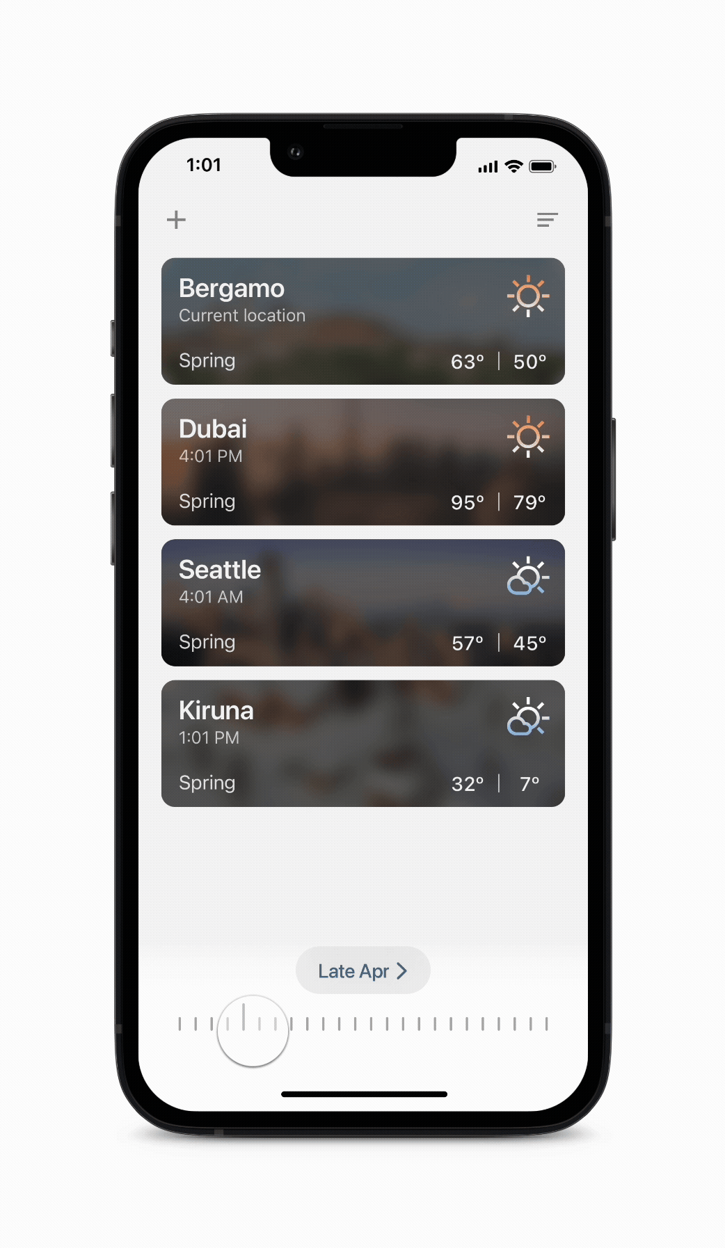
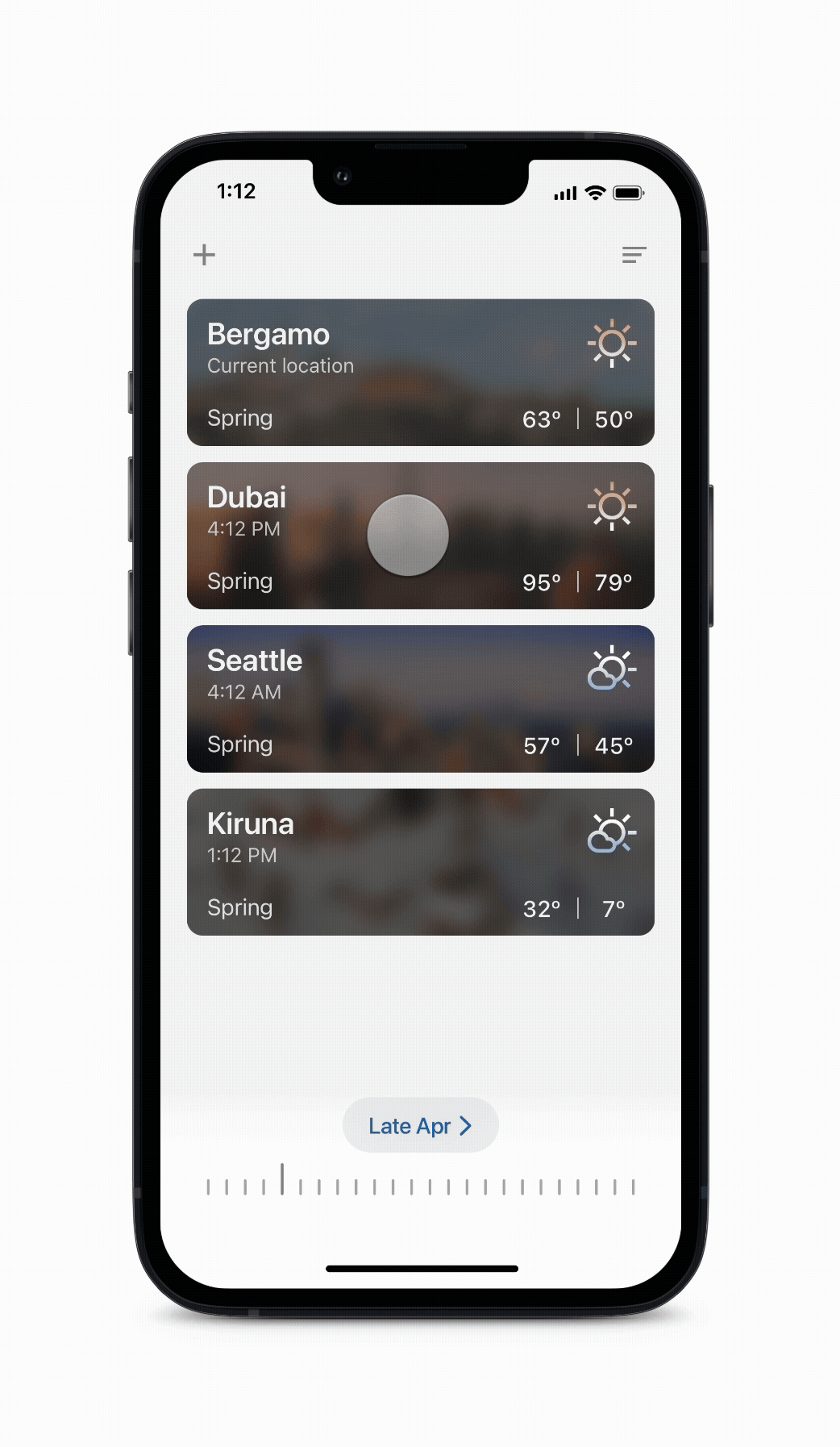
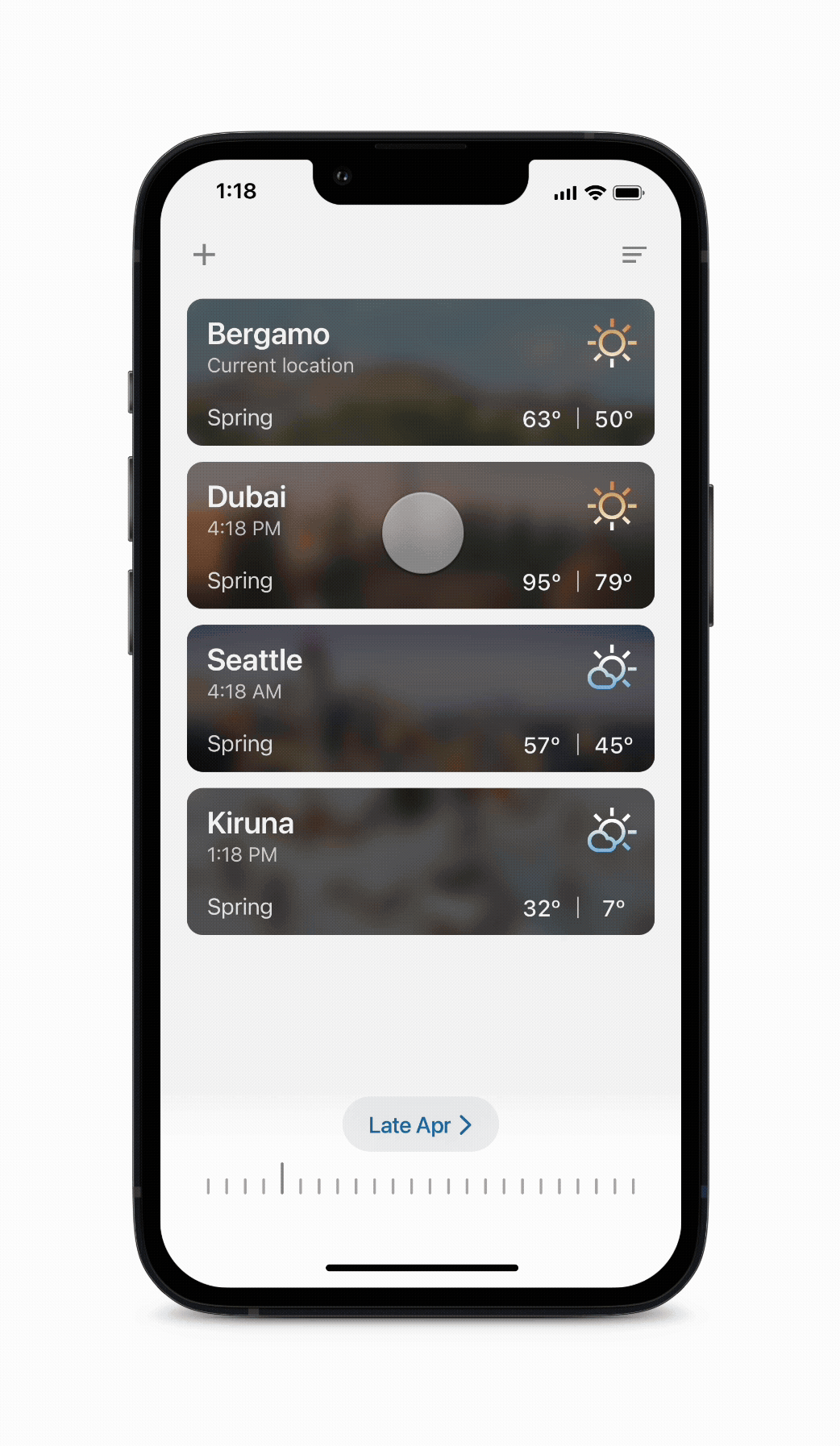
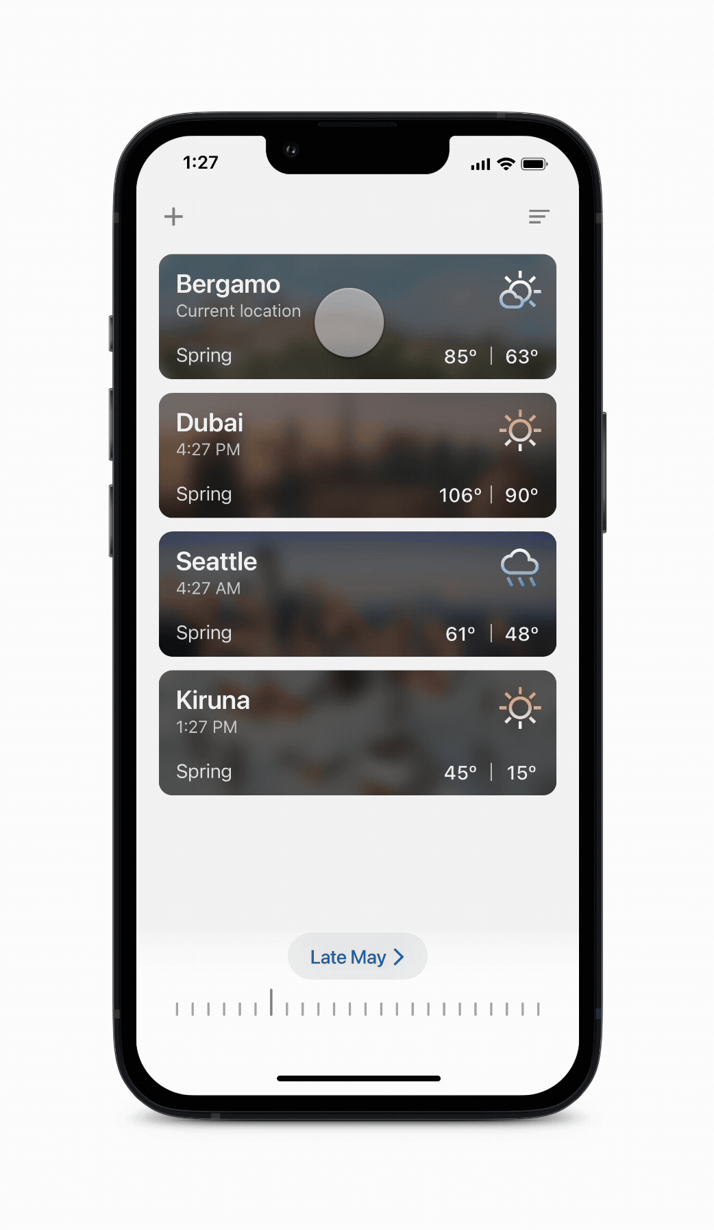
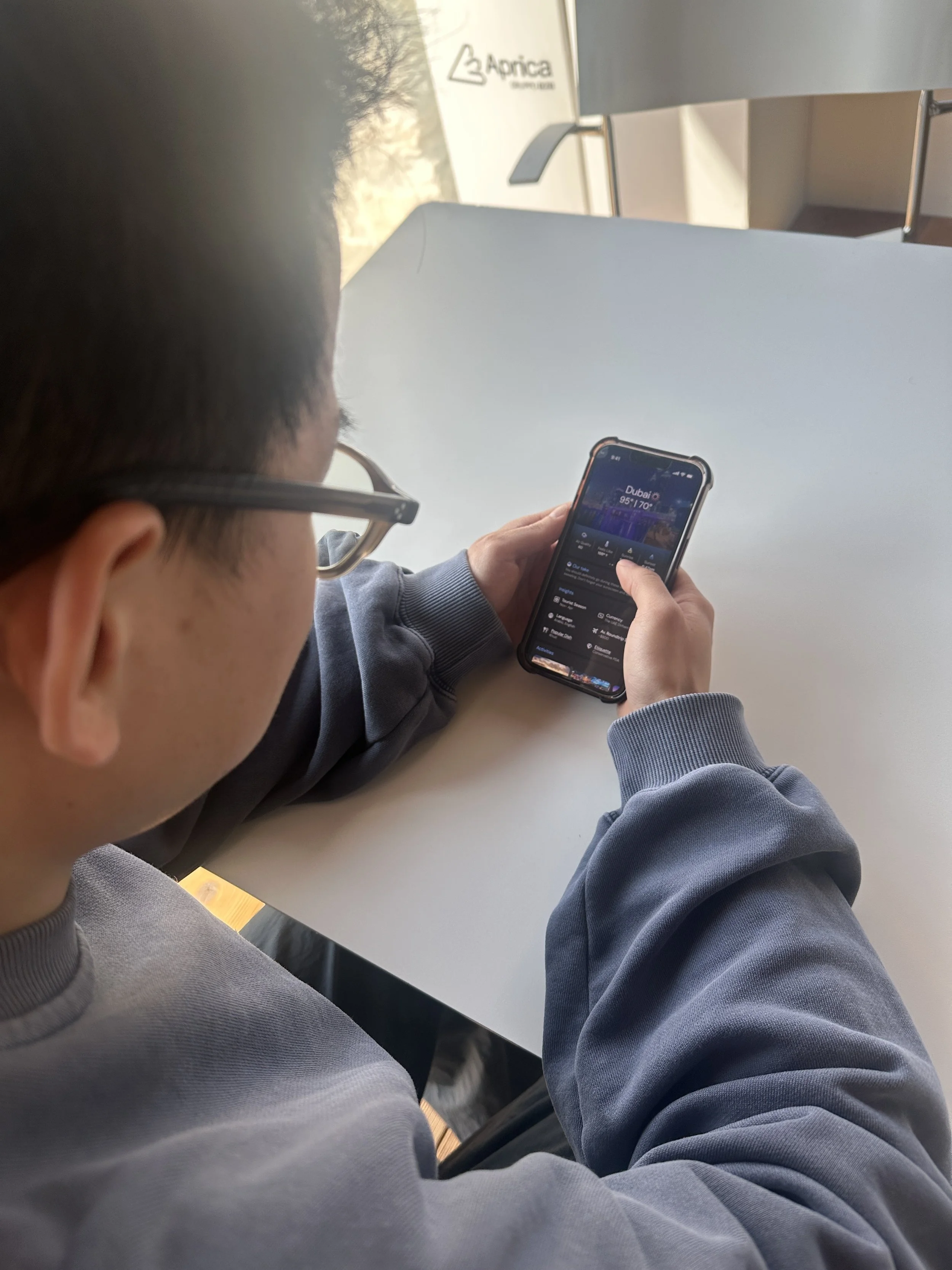
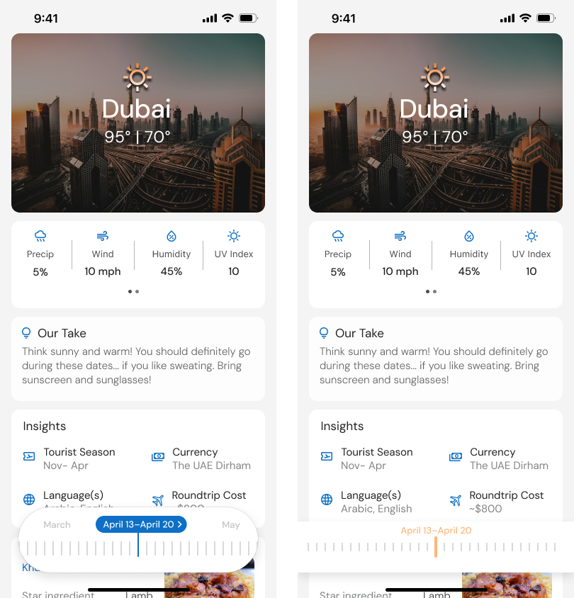
Compare Screen
I focused on an interaction where users can compare the weather of multiple locations at the same time by using a slider. They can see the highs, lows, and seasons change with the month. I also focused on working with lighter colors and blurring images to ensure the words are legible.
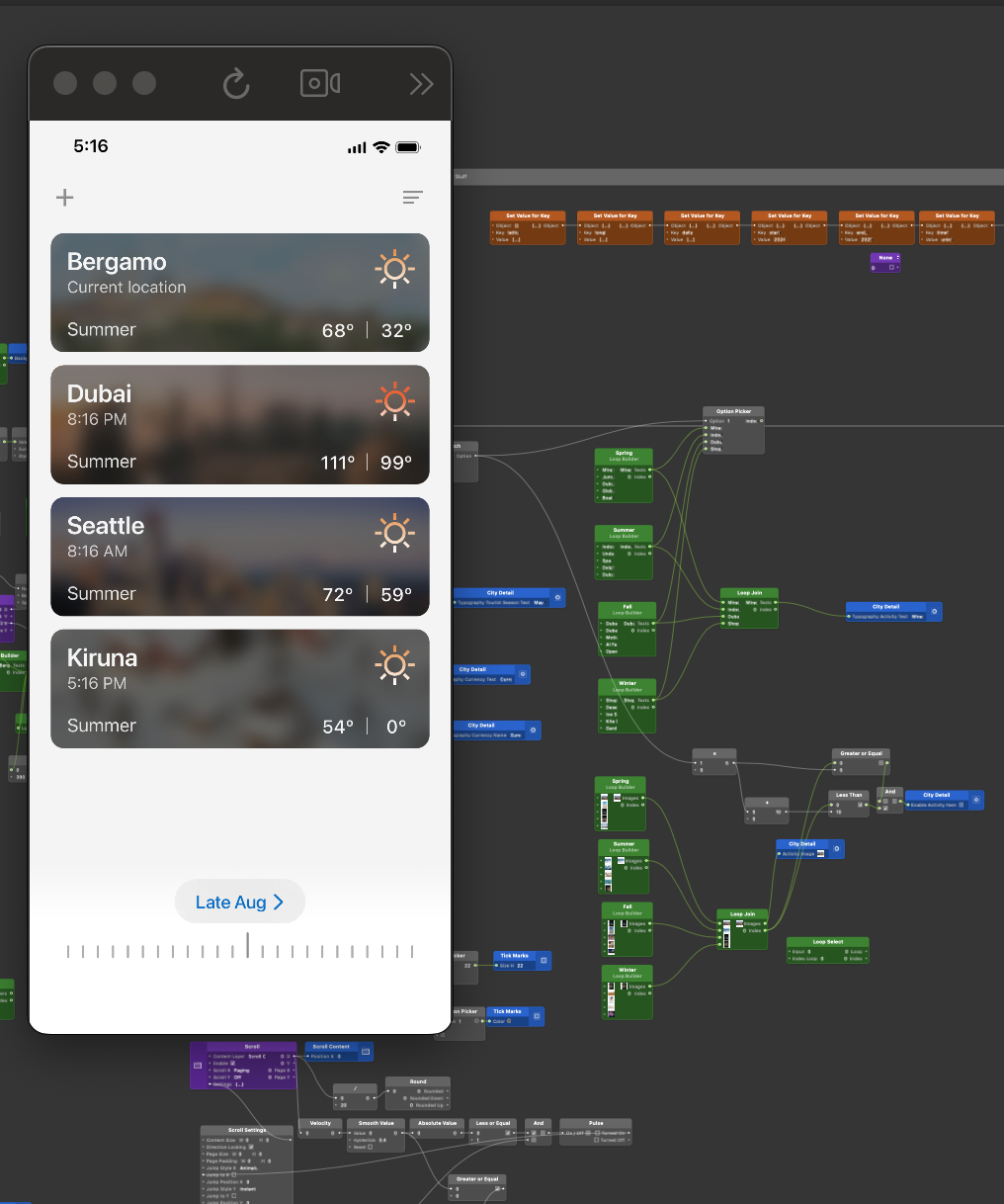
Location Screen
Users can also use the slider in a location view. They can see how weather stats and overview change by month for all locations.
Location Screen Cont.
Additionally, users can see how flight cost can change and they also have access to the different activities that are available in that location by season.
Swiping
Users can swipe between locations and continue to use the slider to see information specific to that place. The blurred images from the comparison screen become clear when the user swipes into a new location and users can select a button to see a calendar view for choosing dates.
Process
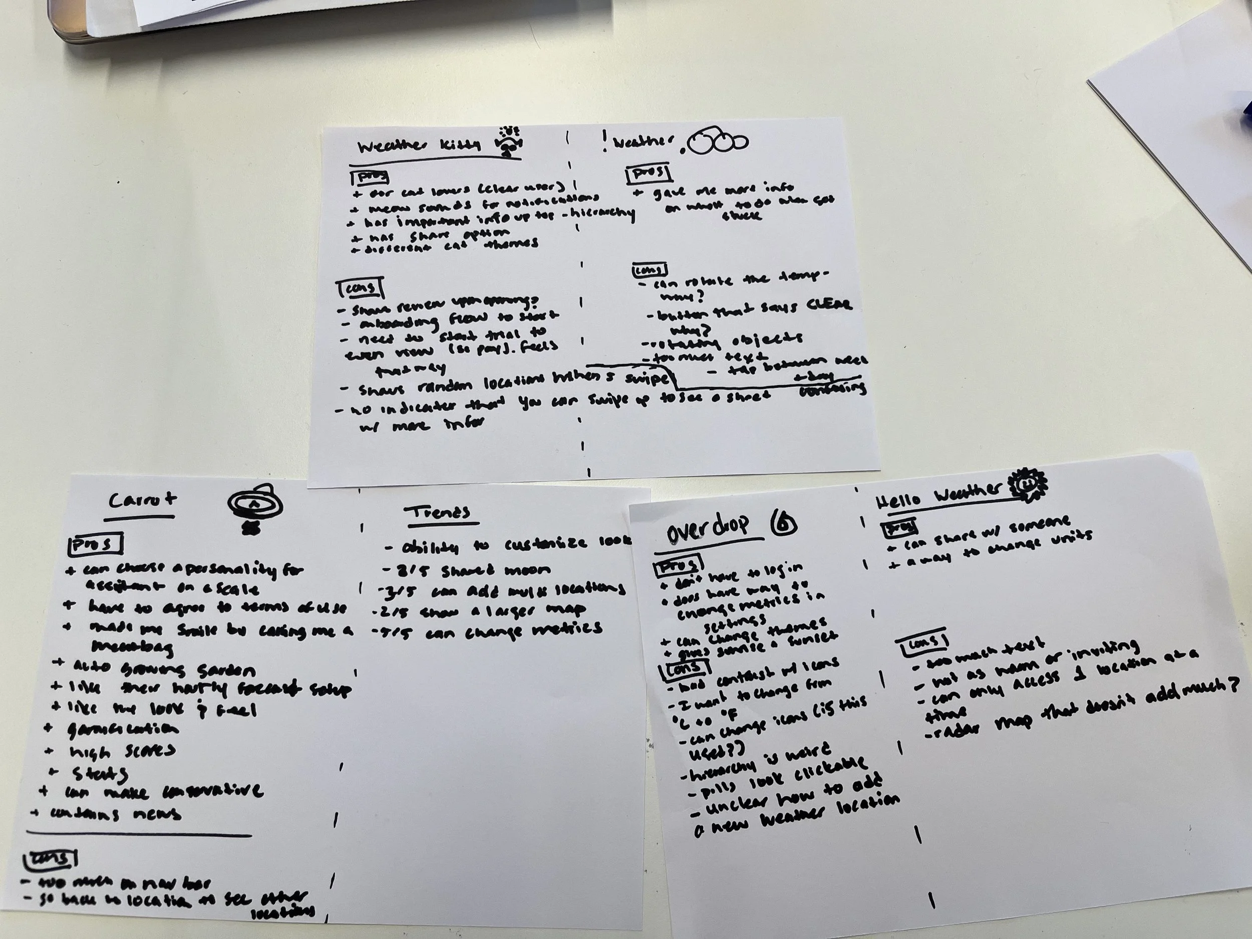
Desk Research
Define
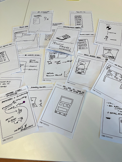
Ideate

Prototype & Iterate
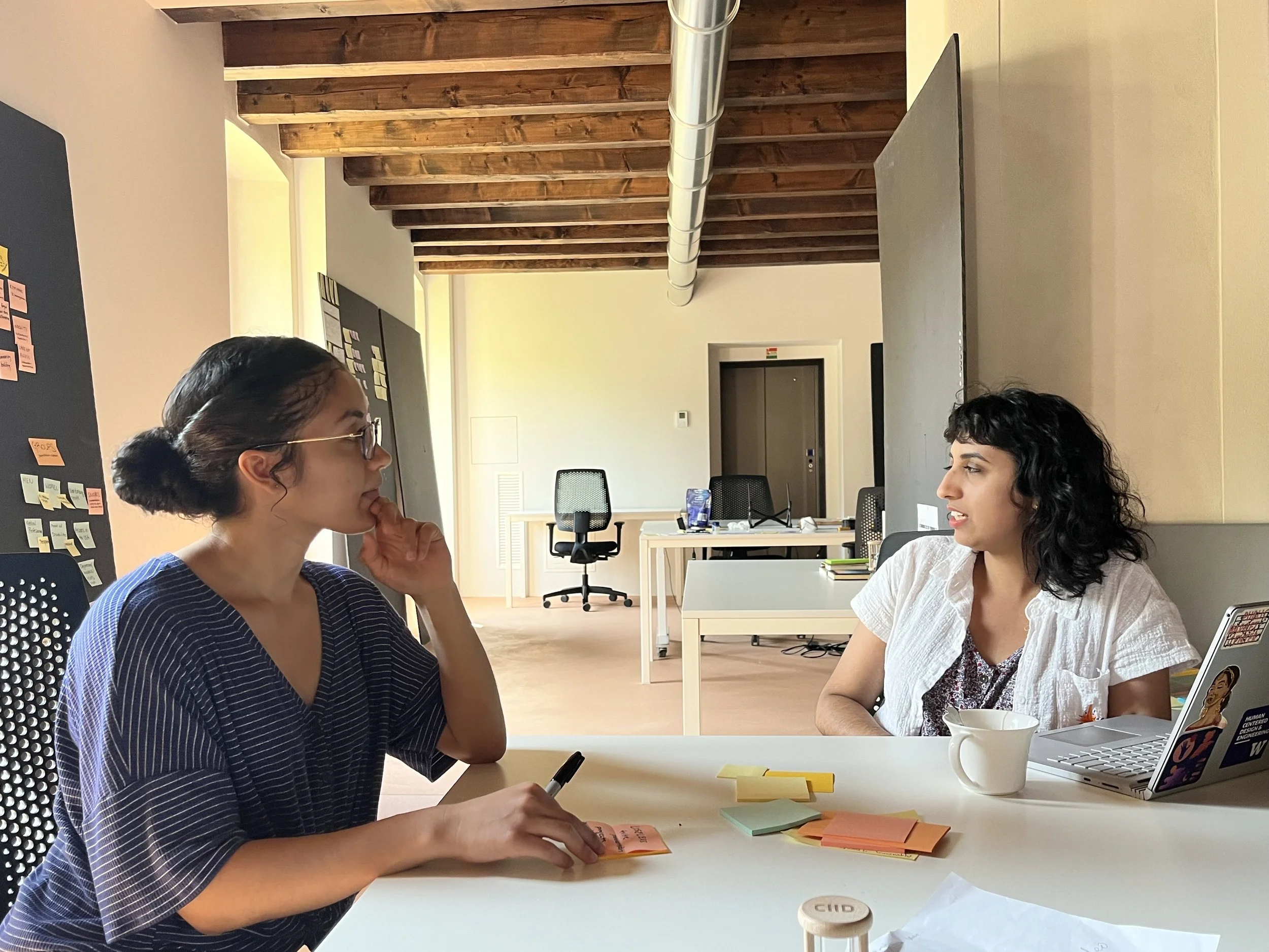
Test
Iterate
Learnings & Next Steps
My biggest learning was that I need to be intentional with everything I add to a design or interaction. My initial prototypes had background gradients and colored text. My instructor challenged me on this asking me why I wanted to use a gradient or colors in certain places. When I didn’t have an answer, I knew it wasn’t necessary.
Additionally, it’s key to reference well designed apps for spacing and text placement. Imitating is a compliment and it’s allowed in product design.
In addition to testing my interaction with more users, I’d love to test the information included. The information included was based on information I would want to know when traveling. However, how does the current information help other travelers in deciding where to go?
I’d also love to continue iterating on the design in order to achieve a cleaner look and feel.