Detailed Process for “ForeTravel”

Research
I compared several weather apps to not only get inspired but also understand what information they contain and how it’s displayed. I created a pro and con list for each app to understand what stood out in terms of design and information.
I was inspired by the ability to add multiple locations, as not every app had this. Additionally, I was inspired by the personality of the weather app “Carrot” and knew I wanted my app to also have a personality.

Define
Knowing that I have a passion for travel, I began asking my classmates why it’s important for them to know the weather when they’re traveling. What does that allow them to do? They mentioned that they need to know what to expect ahead of time so that they know what to wear, what to bring, and what activities they can do.
This was the beginning of my ideation process. I knew that I wanted to help travelers when it came to preparing for new locations.
Ideate
During my ideation session, I thought about creating an app with a mascot that wore the items that you might need that day. I thought about creating a weather app focused on outdoor activities and an app that was social and allowed you to see where in the world your friends might be including the weather in that location.
I landed on ForeTravel when I thought about a recent problem I had. I was going to travel for spring break but didn’t know where to go. To help me decide, I searched the anticipated weather of five specific locations to narrow down my choice. I knew I wanted to be somewhere warm.
App with a mascot, showing users what they need when going outside.
Prototyping & Iterating
I started the prototyping process with paper and digital wireframes. I then used Figma to build hi-fi prototypes. I was inspired by weather apps like “Apple Weather,” “Carrot weather,” and “(Not boring) Weather” and referenced them when considering spacing, content, and interactions.

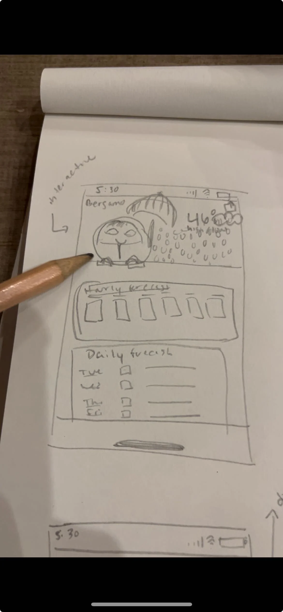
I first started with paper wireframes in order to easily experiment with layouts. I knew I wanted to implement a slider so users can scroll through different pieces of information but knew a date picker was important for accessibility reasons.

I then moved onto Figma where I created digital wireframes for the onboarding flow, the location comparison page, and the full page view.

I started working on my high-fidelity prototypes once I had an idea of the layout I wanted. I experimented with gradients and light colors at first.
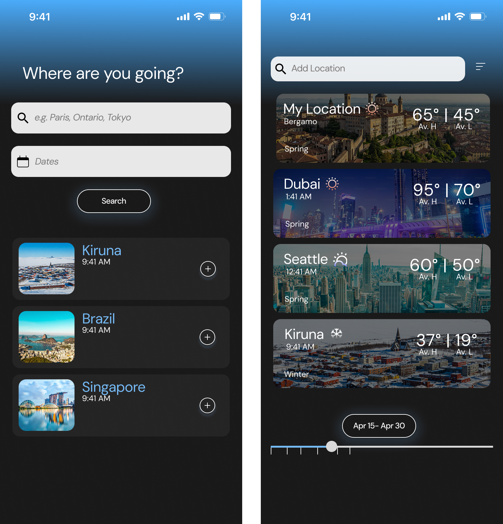
Then I decided to try a dark mode version.

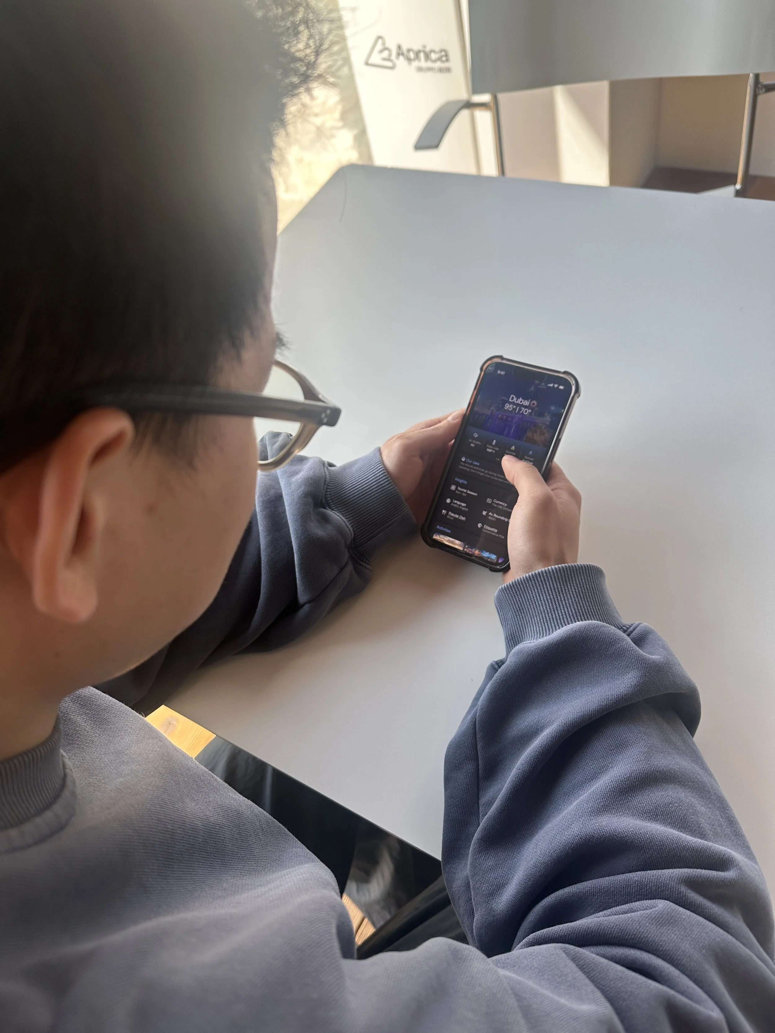
I also tested the look of AI images of locations instead of their real images since I knew what mattered most was the weather information and content.

Lastly, I experimented with several different types of sliders. It took me a while to create one that fit in with the layout and app brand.
Testing

Feedback focused on the legibility of the wording when images were placed behind them, and using real location images. Users did not want to see an AI generated image if real images of the place are available. There was also a preference for lighter colors since it led to a cleaner look where users can focus more on the content. This feedback led to my final iteration, where I decided to focus on light colors and real images in order to concentrate more on the content and interactions.
Data
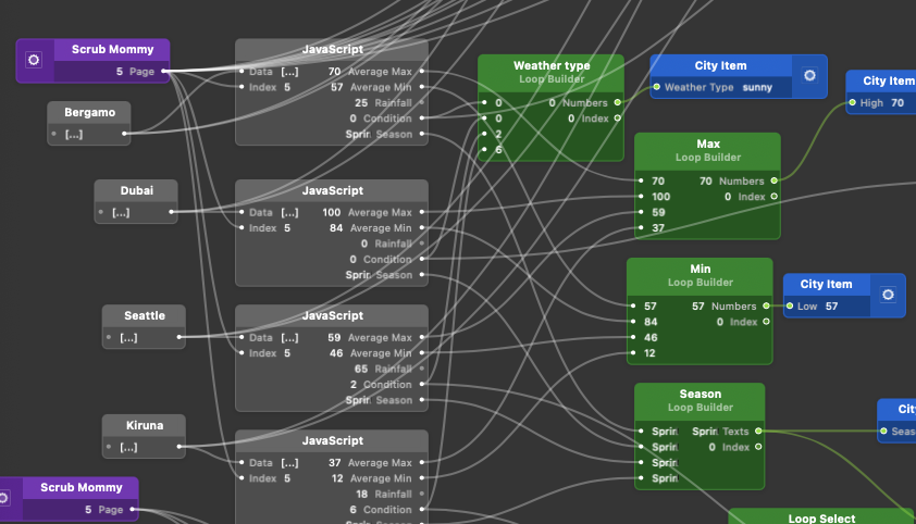
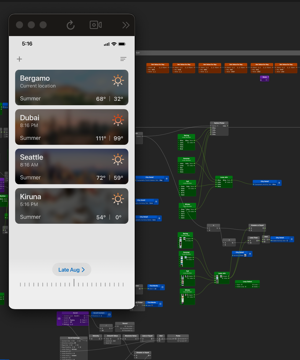
I created the entire functioning prototype in Origami Studio by importing the Figma frames. The data in my weather app was generated by ChatGPT, where I asked it to create realistic weather data for specific locations. The data was then entered into a JavaScript patch that was connected to loop builders in Origami Studio.